
Themes
Choosing one, what settings carry across, editing templates safely, the homepage blocks, building a page from sections, and what to check before activating.
Settings, Appearance, Theme Settings. A theme decides how your shop looks. Your products, pages, orders, customers and settings are not part of it, so changing theme does not touch any of them.
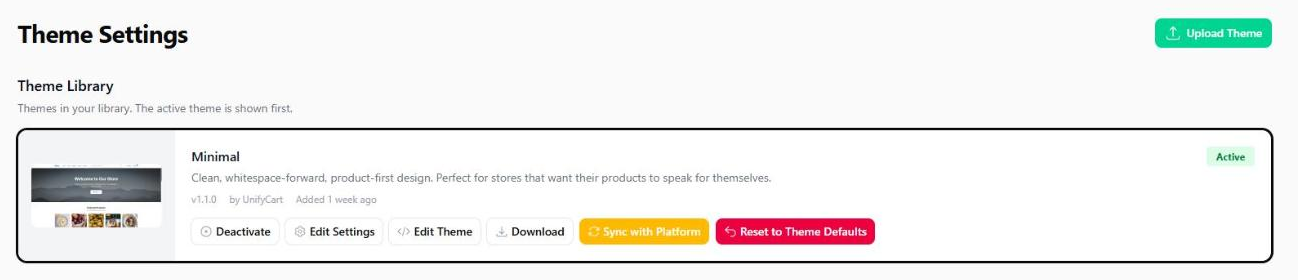
Your library holds the themes you have added, active one first. Anything else available on the platform appears under Available Themes and can be added to your library without being activated, which is how you look at one before committing.
The Buttons on a Theme
Edit Settings changes colours, fonts, labels and which blocks appear. Almost everything you want to change lives here, and nothing in it can break the shop.
Edit Theme opens the templates themselves. That is a code editor, and a mistake there takes the shop down rather than making it look odd.
Download takes a copy of the theme as it currently stands, including your own edits to it.
Deactivate switches it off, which only makes sense once another theme is active.
Sync with Platform pulls the platform's current version of a theme over yours. It is how you take an update, and it will overwrite template edits you have made.
Reset to Theme Defaults puts the shop back to the way the theme ships. It is the only button here that throws your own work away, so it is covered on its own below.
Take a copy before you edit templates or sync
Download the theme you are running first. If an edit goes wrong, or a sync replaces something you changed, you then have the exact version you were on, rather than the platform's current version of it, which may already differ from yours.
Clicking a theme's picture opens it at full size, which is worth doing before you add one.
Starting Again
Reset to Theme Defaults, on the active theme, undoes your configuration and puts back what the theme was built to look like. Three parts, each one a tick box, all ticked to begin with:
Theme settings. Colours, fonts, labels, every choice on the settings screen. Your logo and your favicon are kept, because they are yours rather than the theme's.
Homepage blocks. The homepage goes back to the arrangement the theme intends. Blocks you added are removed and blocks you hid come back.
Content pages. The pages the theme ships are replaced with its versions. Pages you created yourself are not touched.
Your pages are backed up first, automatically. You will find the backup under Restore Backup on the Pages screen, named for the moment you reset. Settings and the homepage are not backed up, because what replaces them is the theme itself.
Reset one part, not all three
The tick boxes are the point. A homepage you have made a mess of can go back without touching the pages you have spent a morning writing.
Switching Themes
Settings are not the same from one theme to the next: a theme with no sidebar has nothing to configure a sidebar with, and one that calls them Publishers has a label another theme does not possess. So a new theme starts at its own defaults and your shop will look unconfigured until you have been through them.
Your settings are not kept when you switch
A shop holds one set of theme settings. Switch to another theme, change anything, and switch back, and you will find the second theme's values rather than the ones you had tuned.
Write down anything you have spent time on, or take a Download of the theme first, before you try another one.
Your pages, your homepage blocks, your products and your orders are not part of a theme and are not affected by switching.
That is the argument for trying a theme outside your busiest hours.
What a Theme Controls
Colour and type. The primary colour used for buttons and links, text colours, and the typeface.
Layout. How many products sit in a row on a desktop and on a mobile device, how many per page, whether a sidebar appears.
The homepage. Which blocks appear and in what order, covered below.
What is shown on a product. Whether stock levels are visible, whether reviews appear, whether related products are suggested.
Filters. Whether the shop offers a brand or publisher filter, a price range, an in-stock toggle, and what those filters are called.
The blog. Whether the listing shows articles as rows or as tiles, how many to a page, what appears on each one, and how a single article reads: narrow or wide, with or without its image, author, date, reading time, share links and the links to the article either side of it.
Words. Many labels are editable, so Brands can read Publishers, and Shop can read Catalog, without touching a template.
What a theme does not control: your menus, your pages, your product data, your prices, or anything about how an order behaves.
The Homepage
The homepage is assembled from blocks your theme provides rather than being a page you write, and activating a theme lays out its own. That has a guide of its own: Homepage Builder.
Building a Page From Sections
A content page can be written as text, built from sections, or both. Pages, open a page, the Page Builder tab.
Writing it as text is the Content tab, and is what every page does until you say otherwise. You type, the theme decides the layout.
Building it from sections is the Page Builder tab. You add sections, drag them into the order you want, and fill in each one's settings. Nothing you do there can break the page, because you are filling in fields rather than editing markup.
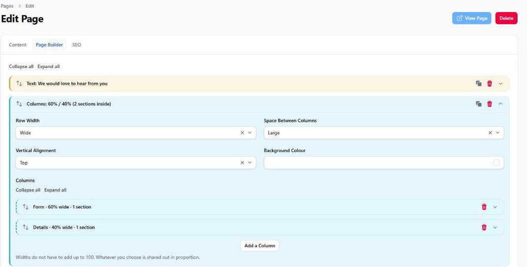
The sections on offer come from your theme, exactly as the homepage blocks do. The default theme offers Columns, Text, Image With Text, Highlights, Table, Questions and Answers, Call To Action, Contact Details, Form, Gift Card Form and Custom HTML. A theme that does not work this way shows nothing on the Page Builder tab, and its pages keep using the layouts its designer wrote. Both are legitimate, and which you get depends on the theme you are running.
A page is either written or built, never both
Add a section and the page is built from sections from then on. The Content tab switches off, and everything on the page comes from the Page Builder tab. Use a Text section for words.
Nothing is lost. What you wrote on the Content tab is kept, and remove every section and it comes back exactly as it was.
Leave the Page Builder tab empty and the page behaves exactly as it always has.
Four sections worth knowing. Columns puts sections side by side, covered below. Form puts any of your forms where you want it, so a contact form can sit above your text rather than below it. Questions and Answers is a list you add to, and each question opens when a visitor clicks it. Custom HTML is for the one thing no section covers, and keeps your markup inside a single block rather than letting it become the whole page.
Every section carries the same four controls, so you do not have to learn each one:
Width. Narrow, Medium, Wide or Full. It governs the words as well as the band, so a paragraph set to Narrow holds a comfortable reading column and the same paragraph set to Wide runs the full width. Medium is the one for a table that is cramped at Narrow and adrift at Wide.
Background. None, a tint of your shop colour, light grey, or a colour you pick.
Spacing above and below. None, Tight, Normal or Roomy. Set one to None to make two sections sit tight together.
Alignment. Where a section sits across the page when it is not full width: Left, Centered or Right. Left means the page's own edge, lining up with the title, not the window's.
A Text section adds two of its own: a Heading Size, which is what stops a long policy page reading as a stack of banners, and a Heading Alignment for the case where the title should sit differently from the words under it.
Putting Sections Side by Side
Add a Columns section, then add a column for each side and put sections inside it. A contact page might have the form in one column and your address in another.
Each column has a width for a phone, a tablet and a desktop, so the same row can stack on a phone and sit side by side on a bigger screen. Set both columns to Full width on the phone and the tablet, then 60% and 40% on the desktop, and that is exactly what happens.
The widths do not have to add up to 100. Whatever you choose is shared out in proportion, so two columns set to 60% and 40% and two set to 3 and 2 give the same result. A column set to Full width always takes a row to itself, which is what makes stacking work.
A section cannot tell how wide its column is
A section that arranges itself in several columns, such as Contact Details, reads the width of the window rather than the width of the column it sits in. Inside a narrow column, set its own items per row to one.
You can also drop a form into any text with a token, without using sections at all. Type {form, contact} where you want it to appear, using the form's own slug. The Content tab lists the ones you have.
Before You Activate Anything
Look at five pages, in this order: the homepage, a category, a product, the basket and the checkout. Those cover nearly everything a shopper touches.
Then look at the same five on a mobile device, because that is where most of them will be.
Things that commonly look wrong on a new theme: a logo sized for a different header, product images with a different aspect ratio, and a category with a long name wrapping awkwardly.
A homepage block you have no content for is not one of them. Those hide themselves rather than drawing an empty band, which is also why a block you have switched on can be missing from the page.
If Something Looks Broken After a Change
Check whether it is the theme or the content. Switch to another theme briefly: if the problem follows you, it is your data rather than the theme, and a product with no image or a category with no description is the usual culprit.
Custom Themes
A theme can be built for you and uploaded. The platform reviews an uploaded theme before it can be used, which is a security review rather than a design one.
If you have had one built, keep the source somewhere you control. A theme that exists only on the platform is a theme you cannot rebuild if you move.